
Blog
Colour Psychology – How to Pair Colours with Rattan
Colour Psychology – How to Pair Colours with Rattan
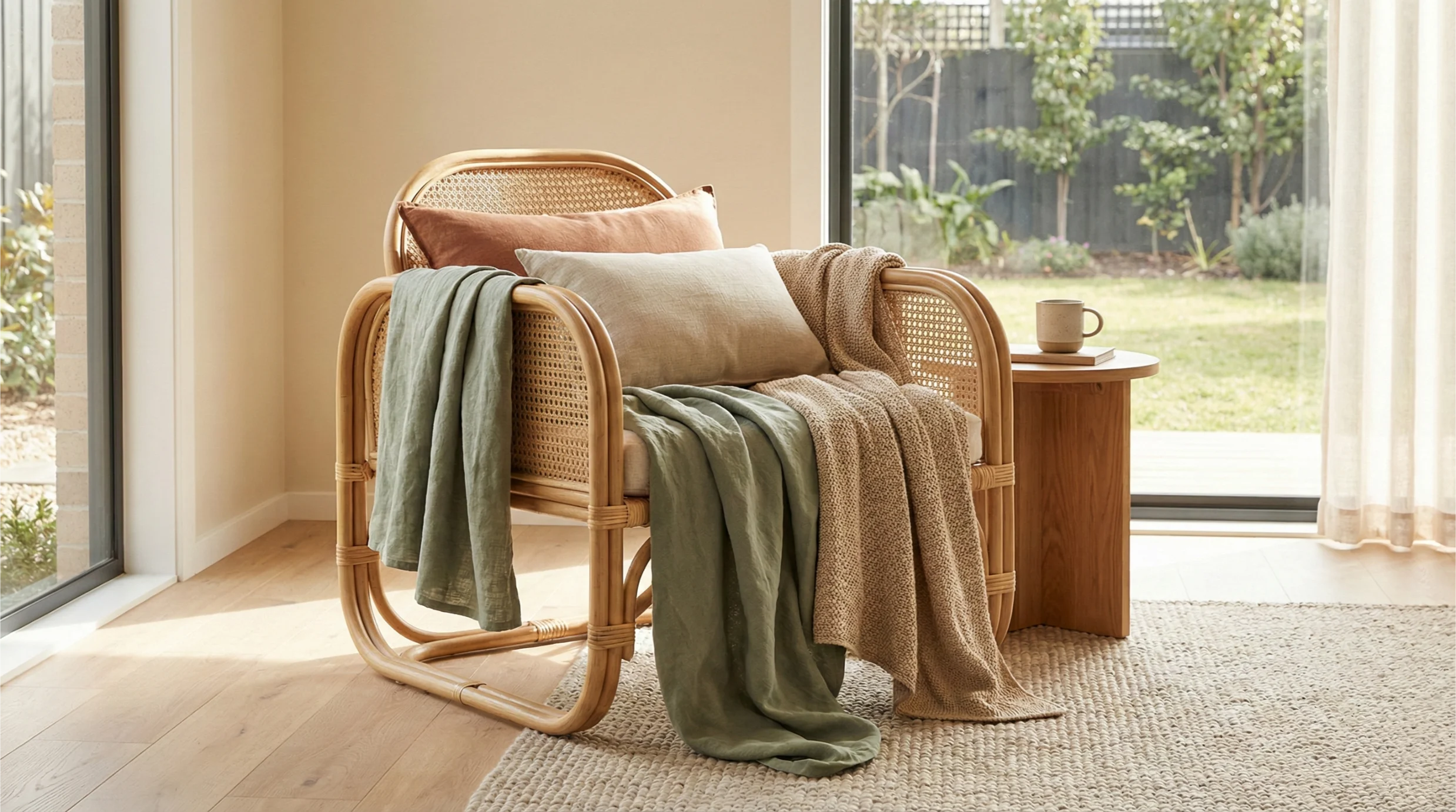
Rattan is naturally warm, calming and textural — which is why it blends so well with many modern Australian interior palettes.
But the colours you pair with rattan can completely transform the feeling of a room.
From soft neutrals to deep earthy tones, colour psychology plays an important role in shaping atmosphere, comfort and emotional balance.
Here’s how to choose colours that work harmoniously with rattan to create calm, welcoming and thoughtfully styled spaces.
—
1. Soft neutrals – the perfect match for rattan
Neutral tones allow rattan’s organic warmth and texture to shine without competition.
These colours create a calming, slow-living atmosphere ideal for modern Australian homes.
Best neutral pairings:
- Warm whites
- Soft beige
- Cream
- Oatmeal
- Light taupe
Neutrals also soften the room’s edges, helping woven textures feel even more inviting.
—
2. Earthy tones – deepen warmth and create grounded spaces
Earthy colours pair beautifully with rattan because they reflect the tones found in nature.
They feel familiar, grounding and warm — perfect for homes inspired by coastal, bush or Australian modern design.
Best earthy tones:
- Terracotta
- Clay
- Burnt umber
- Olive green
- Warm caramel
These colours emphasise rattan’s honey or caramel shades and create a rich, welcoming atmosphere.
—
3. Soft greens – calming and connected to nature
Green is closely tied to feelings of relaxation and renewal.
When paired with rattan, it deepens the indoor–outdoor connection that many Australian homes embrace.
Lovely soft greens:
- Sage
- Eucalyptus
- Moss
- Soft olive
These tones pair beautifully with plants, timber and linen, creating a refreshing yet calming look.
—
4. Charcoal and black – add contrast and modern structure
While rattan is soft and organic, charcoal and black add depth and a contemporary edge.
This pairing is ideal for modern Australian interiors that balance warmth with clean architectural lines.
Use charcoal sparingly through:
- Metal fixtures
- Framed wall art
- Lamps
- Statement furniture legs
This contrast helps highlight rattan textures rather than overpower them.
—
5. Soft pastels – gentle, airy and uplifting
Pastels bring a sense of lightness and softness that complements rattan’s natural character.
They work well in bedrooms, nurseries or living spaces where you want a gentle and uplifting mood.
Rattan-friendly pastels:
- Blush
- Muted peach
- Misty blue
- Soft lavender
These tones create a dreamy, airy ambience without feeling overly playful.
—
6. Deep blues – serene and grounding
Deeper blues add a sense of depth and sophistication while remaining calming.
When paired with rattan, they create a coastal-inspired palette perfect for Australian homes near the sea or those embracing a relaxed atmosphere.
Best deep blues:
- Navy
- Indigo
- Ocean blue
- Storm blue
These tones balance rattan’s warmth with a refreshing coolness.
—
Conclusion
Colour psychology plays a powerful role in shaping how a space feels.
When paired thoughtfully, rattan can shine in almost any palette — from soft neutrals to deep earthy tones to refreshing greens.
By choosing colours that reflect the atmosphere you want to create, you can make your home feel calmer, warmer and more deeply connected to nature.
Rattan’s timeless texture ensures it will always bring balance, character and comfort to Australian interiors.